Using Soundtrack Pro brought from the Apple Store, I was able to look through a variety of different soundtracks from the cinematic section. These are all copyright free as they are provided within the app from Apple.
I found a track I particuarly liked called 'Blackout' and I felt it went well with my trailer. The strings and eery tones fit the mystery and thriller aspect of the film, whilst the piano part of the song make it seem like a drama film, which also fits in with the film's theme.
Cutting the song into parts and looping particular moments of the song, I knew I wanted to use the drum and heavy beats at important parts of the trailer, for example once the girl's face changes to the mask.
I wanted to have a faster sound during the montage/last half of my film trailer and I looked at different songs I could use. Everything I chose seemed to really stand out as it was played after Blackout and it didn't fit right, so I thought I would play around with Blackout's tempo, speed and so on.
I changed the tempo of 'Blackout' and made the pitch slightly higher, which speeds up the music and therefore adds tension. I used this in the last part of the film trailer and faded it out towards the end.
For sound effects, I found a sound called 'Dark Side' which I used at the point where the soundtrack changes tempo. This is to show that there is an obvious point where everything in the trailer speeds up, which is the time that the face of the girl is revealed to be a mask.
Throughout my interim feedback, a few people kept telling me that the little girl and older girl's scream did not fit in with the trailer, as the scream was too short and appeared out of nowhere. So I played around with the editing features of the song to see how it would be worked.
At first I copied a chunk from the middle of the scream and reentered it into the middle, this is so the scream is now longer in duration. I then used the echo effect from Final Cut Pro to extend the scream and make it echo/ The echoing scream reflects the narrative of the film, as the little girl is haunting the older girl. The scream I use is one I recorded of the little girl, and it goes over both visuals of the little girl and older girl screaming, so it shows that the two girls are connected.
Another sound I used within my trailer is another sound effect from the little girl. As the song the girl sings at the beginning is Ring A Ring o'Roses, I wanted to connect the beginning of the trailer with the end of the trailer like a loop. At the beginning the little girl sings one part of the song:
Ring-a-ring o' roses, A pocket full of posies, A-tishoo! A-tishoo! We all fall down.
The song is an urban legend song, which has been around for hundreds of years since 1800s. However, some people say that the song comes from the Black Plague of 1665-1666, where thousands of people died. The song therefore has quite a sinister meaning.
During the last part of my film trailer, I wanted the little girl's singing to echo throughout the montage and end in the final scene. So I recorded here singing another part of the song.
Fishes in the water Fishes in the sea We all jump up With a one, two, three.
I made sure that I positioned the last part of the song to have the countdown to three appear just when the character opens her eyes in the last shot. I also used another effect so that her voice appears like an echo, a voice in a head which is a code of psychological thrillers.
Film trailers are created after a film has been made, by editing different parts of a film for a promotional package. Therefore, it was only ideal for me to come up with a full story for my film and then to make the trailer.
Here is my story:
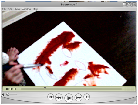
While their mother was sleeping, Mattie brutally murdered her younger brother Michael, who was only 3 years old at the time, with a knife in the kitchen while their mother was asleep. Mattie was only 6. When her mother came into the kitchen, she saw Michael on the floor with his blood everywhere, over the knife and all over Mattie. Mattie was taken into a mental hospital because she was blamed for her brother’s death, which was too much for her mother to handle so her mother committed suicide. After therapy and care, Mattie describes that a dark haired man, with a wonky leg, in a duffle coat had come through the back door and murdered Michael in front of her and that she was innocent. Matthew, a neighbour six doors down, matched this description and was found guilty for the murder meaning that Mattie was able to leave child care when she was 18.
15 years later, Mattie lives in her own apartment, with job and a predominately healthy and stable life despite her past. Mattie appears unaffected by her past, her mother’s death and witnessing the murder of her brother. Suddenly she start’s having nightmares about her childhood, seeing herself with Michael’s blood over her and painting a picture with the blood. Over the week, the nightmares become more vivid and Mattie see’s that the picture her young self is painting is of a mask. Here, her nightmares come into her waking life, as she begins to see her young self on the street, in work and even in her home. The mask too begins appearing in her day to day life, as she sees a man in a duffle coat wearing the mask in shops, in restaurants on dates and at home. Then one day, Mattie is getting ready and she looks into the mirror and sees herself wearing the mask. These nightmares become too much like reality and Mattie becomes frightened. Mattie goes back to the child care home she grew up in and asks to see the physiatrist, Dr. Kien, to see if she can start therapy again to help her nightmares.
One night, while Mattie is sleeping, she wakes up from another vivid nightmare of her and everyone around her wearing this familiar mask. She wakes up to see that a masked silhouette behind her. She demands to know who the person is and why they are haunting her. The masked person replies that this is just her dream and that Mattie is still in the mental hospital from her childhood. She had been declared insane and started to have happy dreams of a normal life, in a normal apartment, with a normal job and normal friends, being happy and healthy. However these dreams began to be taken over with the masked man, the one that she told police killed Michael when in fact, Matthew was never arrested. Mattie killed Michael when she was young and was taken to the mental hospital. She has never left.
Bedroom 1 - Bed used for dream scene and opening of door
Kitchen 1 - Used for knife scene
Grassland 1 - Used for running scene
Street 1 - Montage scenes of girl walking and car being drove
Home 1-
All breakable items were placed away from the scene so that they were not at risk of being broken and damaged because this was not my house. Secondly, if the items were broken they could have caused injury to cast and or crew members. There was a natural risk of people tripping, knocking themselves of things and so on, however we avoided these accidents by setting up the tripod, camera and making sure each scene was filmed with no rush.
Home 2-
All items were removed as the little girl was going to be in the hallway. There was a natural risk of people tripping, knocking themselves of things and so on, however we avoided these accidents by setting up the tripod, camera and making sure each scene was filmed with no rush. I had to get permission from the girls' parent to make sure she was ok to be filmed for my media project.
Bedroom 1-
As this was not my bedroom, we had to respect the owner's privacy and therefore we removed objects that would be in shot which were photographs or something similar. This also meant we had to make sure we left the room after filming how we found it. Possible risks were simple hazards such as hurting self on objects, but none of the risks were dangerous.
Kitchen 1-
Kitchen's are very dangerous because of the different utensils that are around, therefore I was sure that no other people were in the room as I was only filming a knife. Because knives are dangerous, I made sure to slowly and carefully apply the fake blood to the knife and that I was wearing safety gloves.
Grassland 1 -
There were many risks on the grassland area, such as litter, holes in ground, trees and wildlife. We made sure not to harm any wildlife during filming and that we did not affect the nature where we filmed. We also checked that no litter or other dangerous materials surrounding the area where we were filming, so that my actor and the crew were safe. Dog mess is another issue we had to check for, to make sure it wasn't in the way of filming.
Street 1 -
Similarly to grassland, the street could have had dog mess, litter or other natural hazards to harm actors or crew. We had to watch out for cars too, but luckily we only used an alley way and a dead end road, so there were fewer cars.
When creating my poster (link here to how I created my poster), I had a few different ideas when making it. Here are some drafts of my poster:
My first idea was a image of the main character but hidden behind the mask. In the character's eye would be a reflection of the little girl from the film trailer.
After many attempts, I realised to pull off this I would need a very creative images to work together. I tried many times but thought of other ideas I could do with the photos I took in my character poster photo shoot.
Here are some other small edits I tried with my images:
I took one image and expanded on it with some editing. I created a poster and asked around in my media class what people thought.
Even before asking, I was not impressed with this poster and therefore I decided I needed to make it look darker, more intimidating and like a psychological thriller.
Here are some edits I created on photoshop. Straight away I thought I was on to something good as I liked the change in the image.
In the second edit of it, I made sure the face was more vibrant and therefore stood out more. I like the idea of a full black background as the film will be quite dark and daunting.
I added the extra information credits and my tagline, which I was both happy with.
Then I tried different coloured text.
One White with a Red outline.
A second just plain Red.
And a third, red with a black outline.
I genrerated a survery where I printed out a copy of each and gave to twenty members of my target audience to see which colour they preferred.
White with Red outline 4
Plain Red 1
Red with a Black outline 15
When I asked these people what genre they thought the film was, they all said horror and some said 'horror/thriller'. When I asked why, they all said that the text reminded them of blood and therefore horror.
Even though my film features blood, it is not specifically a horror but a psychological thriller. Therefore, I am going to change the type of font so that is it more basic for a film poster (like the ones below) but stick to the colour of the one with the most votes. Red with a Black outline.
At the beginning of my project, I created a questionnaire that 20 people answered for me, to help plan my project. (HERE)
Here are the results that were subjected around my ancillary tasks (film magazine front cover and film poster).
11. Most people are interested in buying a magazine just for the story on the front, so I will have to make sure my magazine front cover is engaging for audiences.
12. Even more people would actually buy a magazine if it starred a character or actor from a film they are interested in. This will help me when planning what to feature on my magazine front cover.
13. From this question I found that posters are still as important when promoting a film, so I will have to ensure that the poster aims to sell the film just like the trailer.
14. Half of my audience said that a character or icon from the film needs to be featured on a poster to make them want to see it or take an interest in the film. While a quarter say that a still image from a scene takes their interest. The actual film title or actors wasn’t such a big factor, according to my questionnaire results, so I will need to take more consideration when creating my poster to use a scene or icons.
The production company of a film is featured within the trailer for that said film. Depending on how big the film, a film can have a few different production companies and companies who represent the film, or if it is a smaller, more arty independent film there might only be one production company or sometimes even no production company if the creator has no sponsors.
Looking at existing film production companies titles in trailers, I wanted to see what they all had similar.
Black Swan trailer:
The Machinst trailer:
Donnie Darko trailer:
The trailer logos are relatively short in time (compared to their logo at the beginning of films examples are here, here and here), so I need to make sure mine is quite short in time too.
They don't include music, which is different to when they are used at the beginning of films, so they are either mute or have ambient sounds from the trailer or non-deigetic music over them, so they are part of the trailer and only a quick glance to the promoters.
They are shown near the beginning of the film trailers, but not always at the very beginning. Sometimes, a few scenes are scene as a 'cold opening' in a way, because they reveal some of the plot and introduce audiences to characters.
For example the trailer for Black Swan showed their production company at the very beginning, whereas Donnie Darko and The Machinist had a few scenes before to act as the cold open.
My production company must appear in the same way, by being short in time, mute, clearly showing who the promoter is as well as appearing near the beginning of the trailer or a bit after a few scenes.
Creating my own company:
I liked the idea of having '_____ productions' as my company, so I had to think of names that would work. I wanted a name which could be used for a person, instead of a physical object of thing. One of my favourite books is Catcher In The Rye and I like the named Holden Caulfield, and therefore thought 'Caulfield Productions' worked nicely. This is similarly to Walt Disney productions, Tyler Perry studios and The Weinstein Company as they are all named after people.
Caulfield also works because it does not necessarily have to be a person's name, and it works similarly to 20th Century Fox, DreamWorks and Columbia Pictures.
For my production company, I used the different techniques and keypoints within Final Cut Pro to create my own film visual jingle for the middle of my trailer. It will be featured after the 'cold opening' scene of my trailer, which appears first for audiences to become intrigued. I used a dark red background for my production company, because the film's that my company produce are recognised as being thrillers and quite dark, narrative heavy films. The theme of red also relates to my film trailer.
Looking at existing production company's of my inspiration psychological films I had to research what type of film's my company will produce and distribute.
Black Swan: Fox Searchlight Pictures and Crosscreek Pictures
Fox Searchlight Pictures began in 1994 and is a division of 20th Century Fox. Film's produced under this divison are usually independent or British films, as well as dramegdy's and horrors. The company is also known for releasing non-english speaking films. Fox Searchlight have a huge part in the production of their films as well as the distribution.
Donnie Darko: 20th Century Fox
20th Century Fox is one of the biggest American studios (2011), which release not only film, but TV shows too. It is part of the huge conglomorant of News Corporation Company (which is featured at the bottom of the logo)
They are well known for relasing huge franchise films as well as producing smaller films here and there. 20th Century Fox will usually buy a film after it has been made to distribute it, if they believe that the film will become a sucess.
The Machinst: Paramount Classics
Paramount Classics is a division of Paramount productions (as seen within the background of the logo underneath, as it fits in with the classic logo for Paramount). Viacom is the parent company of many different divisions such as Paramound and Paramount Classics. Now, Paramount Classics are renamed to Paramount Vantage.
When first launched in 1998, they were most known for their art house films as their parent company would deal with the more mainstream releases. Then in 2006, when the company name was changed (and previous owners fired) the company PAramont Vantage have stated on their site that they are a distributor of '"smaller, review-driven films including foreign-language acquisitions and documentaries."
Caulfield Productions will release films that are dark, psychological but also quite arty. It will be a well known production company for these genres of films, such as psychological thriller, thrillers, crime and action films too.
In recent years, film trailers releases have been premiered online as big releases which have gathered a following generate quite a bit of buzz when films are released. At the beginning of the film trailers, a green screen from the Motion Picture Assosication of America (MPAA) shows who the trailer has been appropiately rated for. Because America is one of the biggest countries to produce english language spoken films, the MPAA dominates the release of most films.
From the official site: http://www.mpaa.org/ratings/how-to-read-a-rating the MPAA explain how to read their ratings and how each of their ratings mean. Trailers are rated seperately to their films, so some trailers may have a lower rating than their film because of the content within it, therefore it can be shown at cinemas in conjunction with the film being screened ratings as well as the regulations for showing trailers on television.
Green Band trailers are usually approved for most audiences with the exception being children have to be accompanied by an adult.
Red Band trailers are for mature audiences, as they may show sexual content, strong violence or horror.
As my trailer is meant to be a professional trailer, I am going to follow how other trailers are created. Therefore, I am going to be using the MPAA green screen at the beginning of my film trailer.
During my Interim feedback, a few people said that the font did not match the genre of my film.
Looking at the popular website DaFont.com, I could find fonts to download to use within my trailer.
Looking through the horror category, as the fonts fitted with my genre and theme more, I found five that I think would work best in my trailer and analysed them.
My trailer has a small focus on the colour red and blood, during the scene where the little girl is painting with blood, the blood on the knife and the change to red in my subtitle. So because of this, I'm warming towards the fonts with a drip effect, so I could use the font in red to make it look more like blood. These fonts are Children Should Not Play With Dead Things, Euro Horror and Head Injuries.
However, I still think that Face Your Fears would work good in red, as it would look like blood or at least red paint, has been smeared over a wall which is something a child would do.
The Last Man On Earth font could also work, as it's bold but is uneven and a little wombly, but not enough that it can't be read easily.
Also, at the end of film trailers (and in poster's for my ancillary task), there is a small print font which contains all the extra information about a film for copyright purposes. For this, I will be using the following font:
Here is a video of a few people giving me Interim Feedback about my trailer so far.
A few people mentioned that my font doesn't quite fit the genre. One person said that the font looks too 'cutesy' while another said it looks too 'nice'. I need to further research into fonts appropiate for my trailer.
A few more people suggested doing something extra with the little girl and older girl screaming, such as prolonging the scream throughout a few more scenes or echoing it throughout the entire montage scene.
My teacher, who I did not record, suggested re-filming the small montage clip of a knife with some blood over it, to suggest that it was involved in the murder and to continue the theme of red throughout the trailer.
When re-editing my trailer, I found a much easier way to crop two pieces of film together to make one image. This way, my final image on film looks much neater and more like one film instead of two put together.
I wanted to create a bleak colouring for my trailer, to give it an eery and cold atmosphere and edge to it as it is a psychological thriller. I used a Colour Corrector to achieve this.
After re-filming a few scenes and putting them together in place, I asked my teacher if my product fitted the requirement and made better sense.
Here is the feedback:
Point 1 - 'It is unclear that the first scene is a dream sequence. If it was in a different colour to signify the past or signify it was a dream, this would make it more clear for audiences.'
Point 2 - 'It's also unclear that the little girl at the beginning is the older girl as they don't look similar. In the beginning scene, if the little girl looks into the camera this might make it clearer.'
Point 3- 'The girl walking down the alley doesn't really add much or do much for the story. Improve on it.'
For point 3, I need to try and edit the 3 short clips of the girl being followed down the alley so that they create tension as mid points between the long montage scene. I like the idea of the girl being followed closely, because it is a convention of psychological thrillers, but I need to find a way to incorporate it into the trailer better.
I asked my teacher if the short time of 50 seconds is enough for a teaser trailer for the coursework, she said that an aim of 1minute - 1 minute 30 seconds is more of a reasonable teaser trailer time.
My own feedback of my trailer so far is that I am not happy with it. To improve this, I need to re-edit specific dissolves and transitions, as they do not fit in with the trailer.
Other improvements I thought would be suitable would be to change the colour of footage which is meant to be from the past to colours such as black and white or sepia as it would be clear for the audience to understand that these scenes are to do with the girl's past.
My trailer is still unfinished though, as I need to look at my research into fonts and text for my subtitles as well as create a title for my project overall.
I also need to look at production companies to create my own, as well as finish the soundtrack for the end of the trailer.


